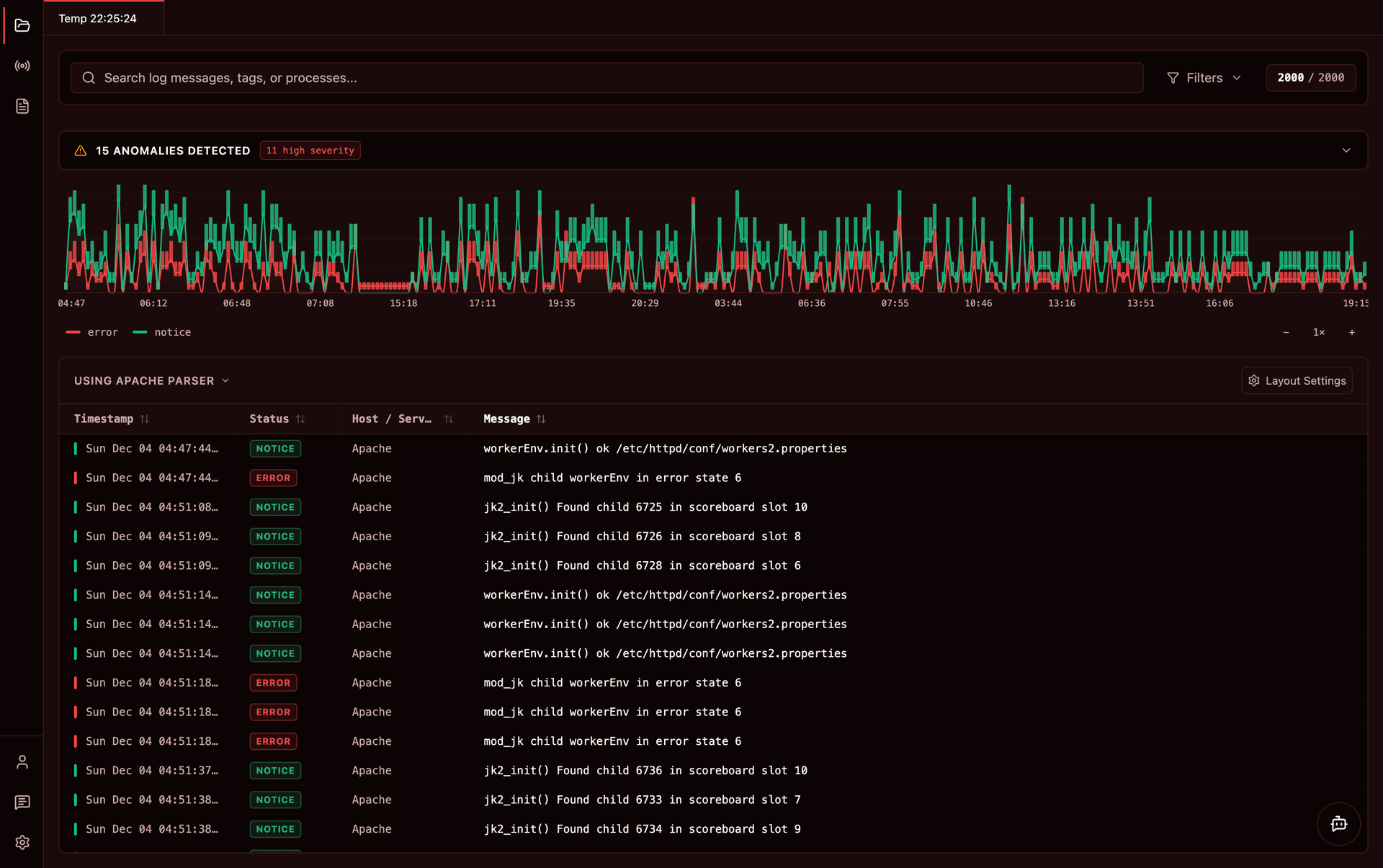
Custom Themes
Personalize Logier with built-in themes or create your own. Build one in your browser with a live preview, or write the JSON by hand — either way it's a file you can edit, share and customize.
Logier comes with several built-in themes, including dark, light, high-contrast, and others like Monokai, Nord, Solarized, and Sepia.
If none of them feel quite right, you can create your own.
The quickest way: the theme builder#
If you would rather not edit JSON, build your theme in the browser instead. The theme builder gives you a colour picker for each value, a live mock of Logier's window that repaints as you go, and a contrast check so you know your log lines will still be readable.
When you are happy with it, press Use in Logier and the app asks whether to import it — no files to move around. See Theme Builder for a walkthrough.
Changing your theme#
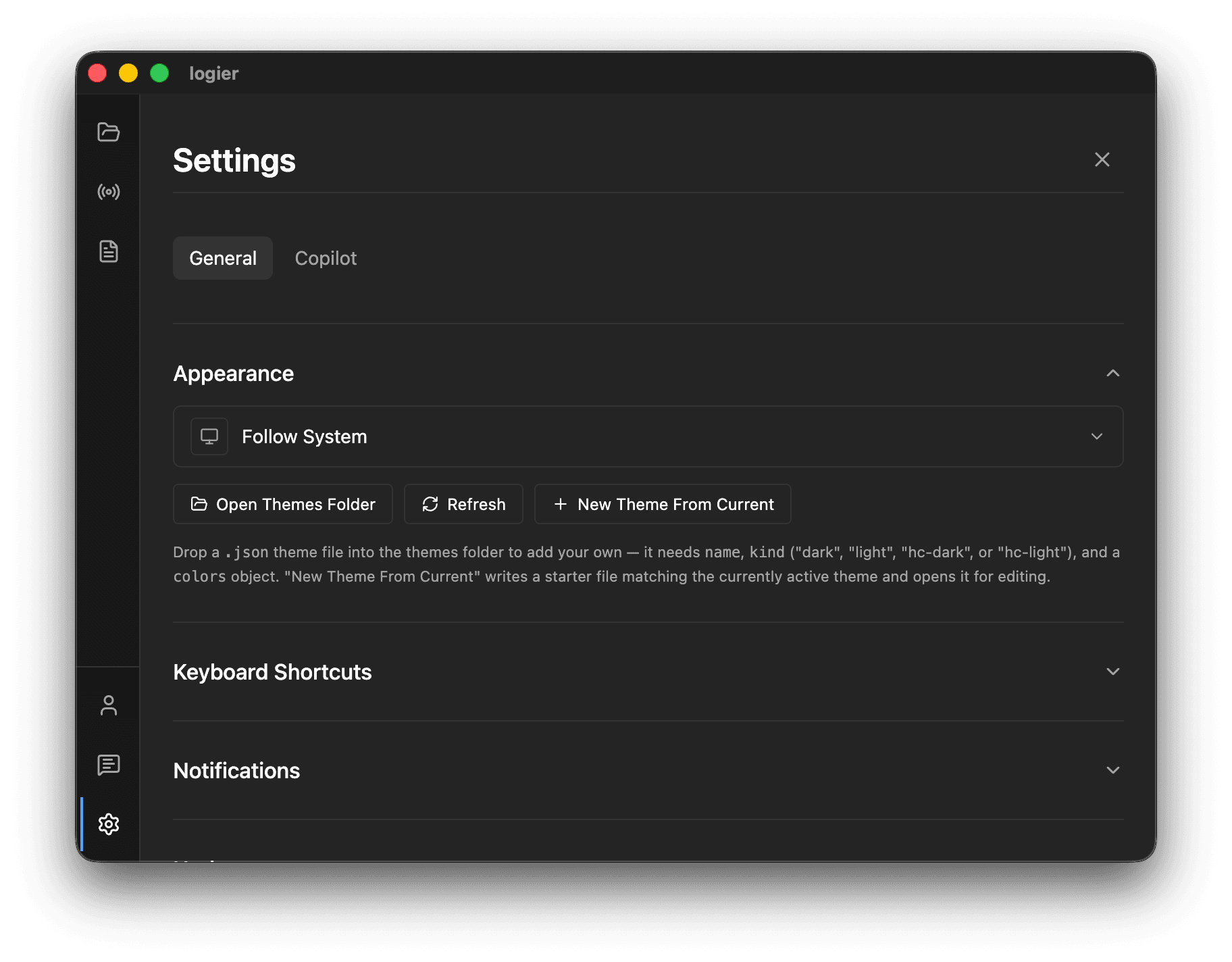
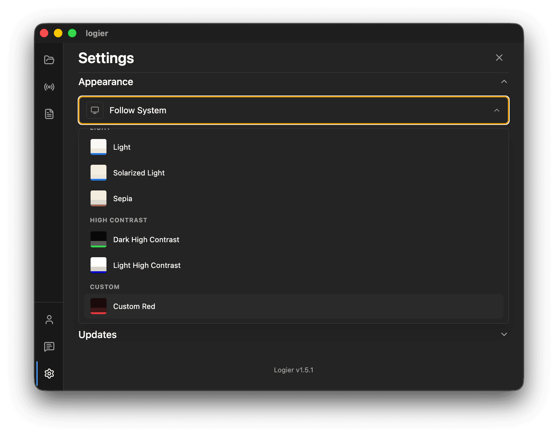
Open Settings → General → Appearance to access the Theme Manager.
From there you can:
- —Select one of the built-in themes
- —Follow your operating system's light/dark mode
- —Create a new theme from the currently active one
- —Open the themes folder
- —Refresh custom themes after making changes
- —Import a theme file someone sent you
- —Export the current theme as a
.jsonfile
Changing themes applies instantly throughout the application.
Creating your first custom theme#
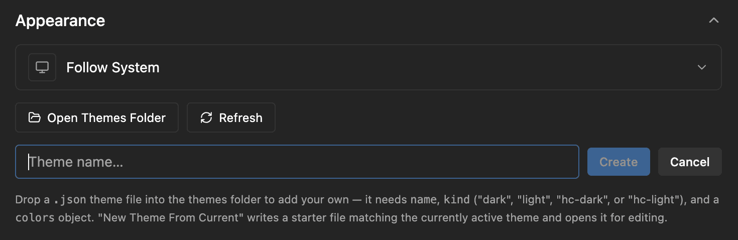
The easiest way to start is by clicking New Theme From Current.
Logier creates a new JSON file based on your currently active theme and automatically opens it in your default editor.
From there, simply adjust the colors and save the file.
Press Refresh in the Theme Manager and your theme will immediately appear under Custom Themes.
Theme location#
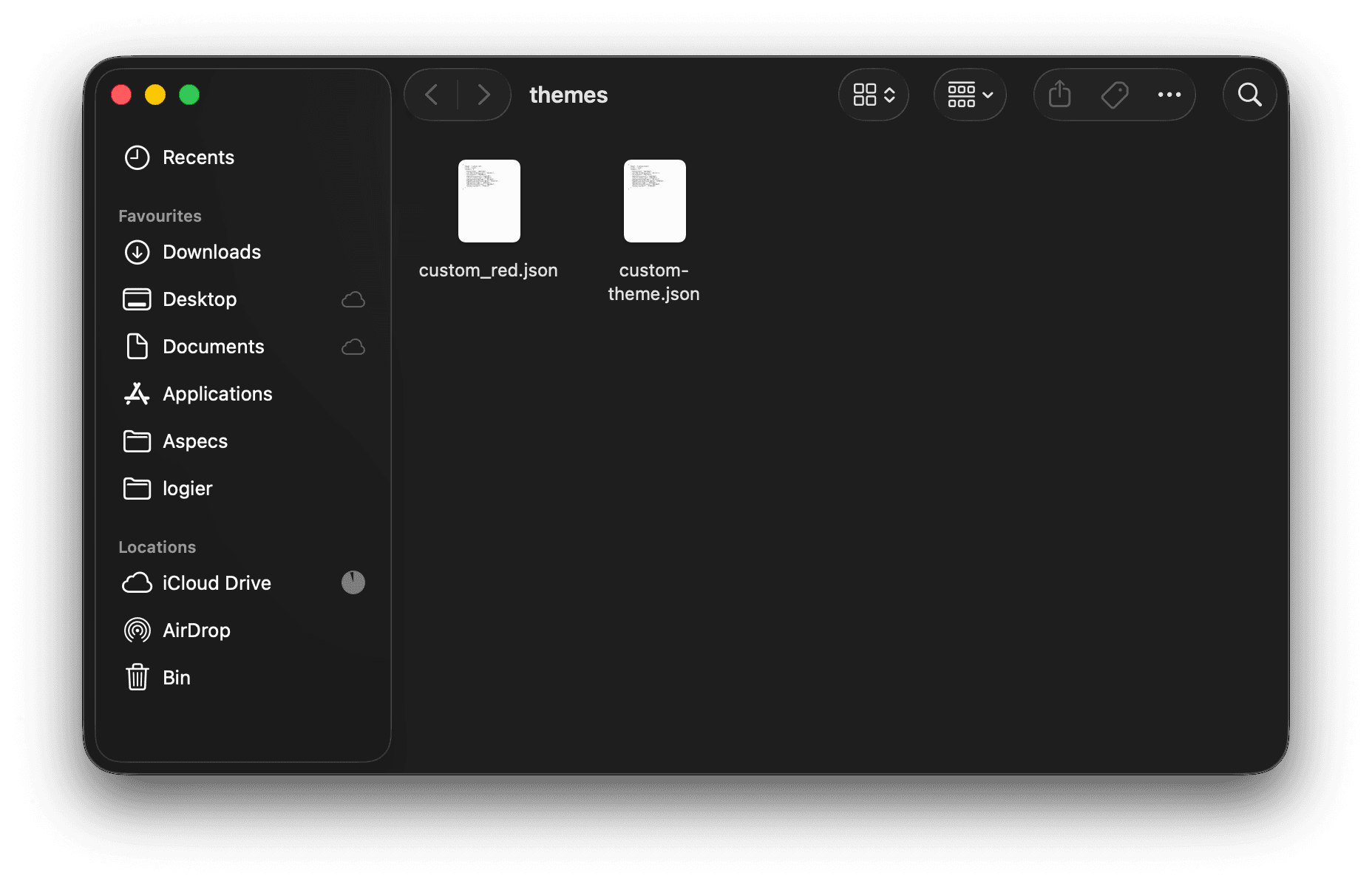
All custom themes are stored inside Logier's themes folder.
You can open it directly by clicking Open Themes Folder in the Theme Manager.
Every .json file inside this folder becomes a selectable theme.
Theme format#
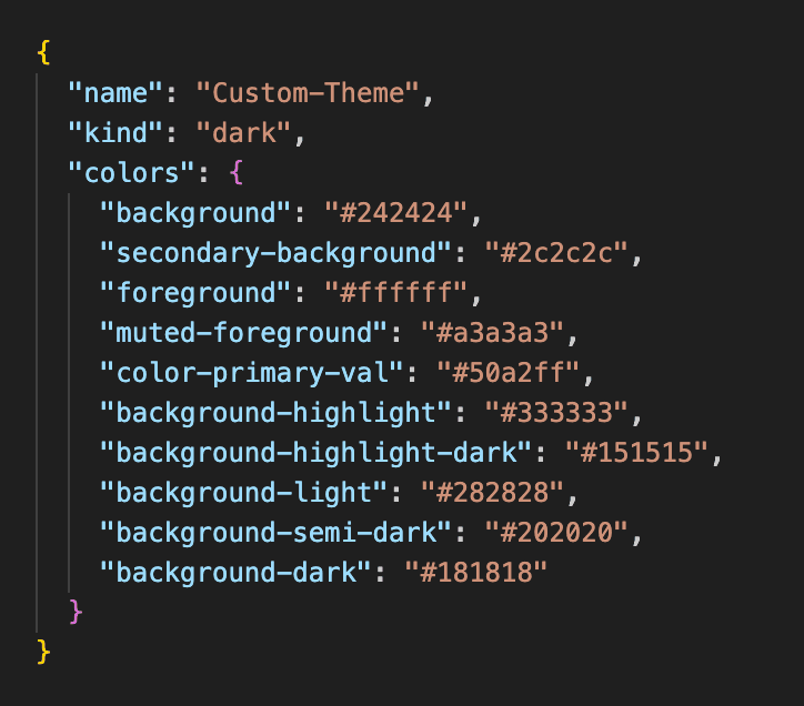
A theme consists of three parts:
- —
name— the display name shown inside Logier - —
kind— the theme type (dark,light,hc-dark, orhc-light) - —
colors— the color palette used throughout the application
A minimal theme looks like this:
Color reference#
Every theme defines the same set of colors.
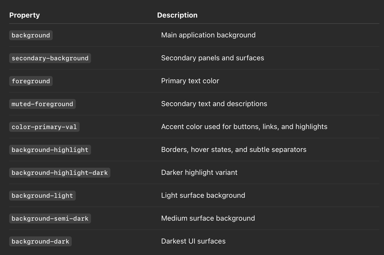
All color values must be valid hexadecimal colors (for example #50a2ff).
Theme kinds#
The kind property tells Logier how the theme should behave.
- —
dark— Standard dark theme - —
light— Standard light theme - —
hc-dark— High-contrast dark theme - —
hc-light— High-contrast light theme
Choosing the correct kind allows Logier to adjust native controls and platform styling appropriately.
Validation#
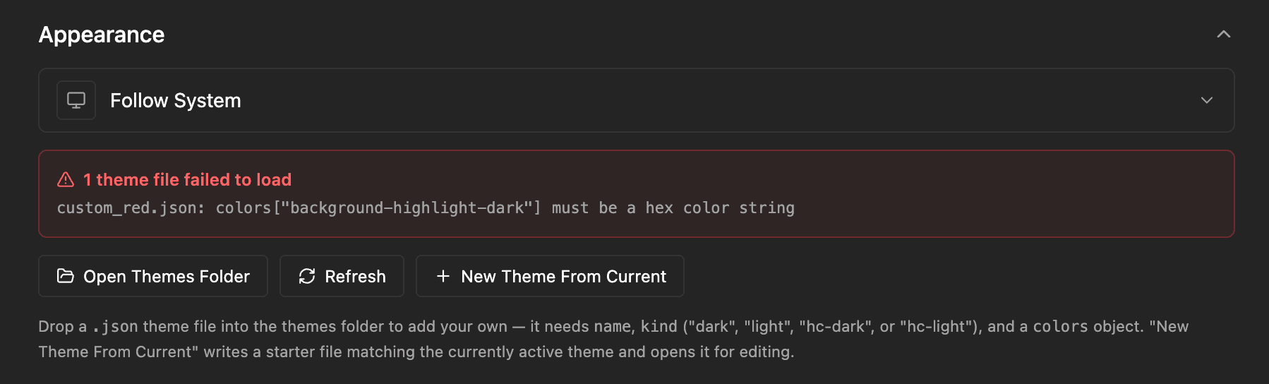
When Logier starts or refreshes custom themes, every theme file is validated automatically.
If a file cannot be loaded—for example because a required color is missing or the JSON is invalid—it will simply be skipped and an error message will appear in the Theme Manager explaining what needs to be fixed.
Share your themes#
Because themes are just JSON files, they're easy to share with others.
Simply send someone the .json file, have them place it inside their themes folder, and press Refresh. The theme will immediately become available inside Logier.
Alternatively, use Import Theme in the Theme Manager to pick the file directly, which saves a trip to the folder.
Custom themes and Settings Sync#
If you use Settings Sync, be aware that it shares which theme you selected, not the theme file. A machine that does not have the file falls back to the default until you install the theme there too — by importing the file, dropping it in the themes folder, or pressing Use in Logier in the theme builder on that machine.